Linna Zhou
OVERVIEW
The Eclipse Soundscapes Project is a NASA Citizen Science initiative studying how solar eclipses impact life on Earth. How can we improve accessibility while working within existing design constraints?
ROLES
UX Design, Accessibility Analyst
TIME
April 2024 - May 2024
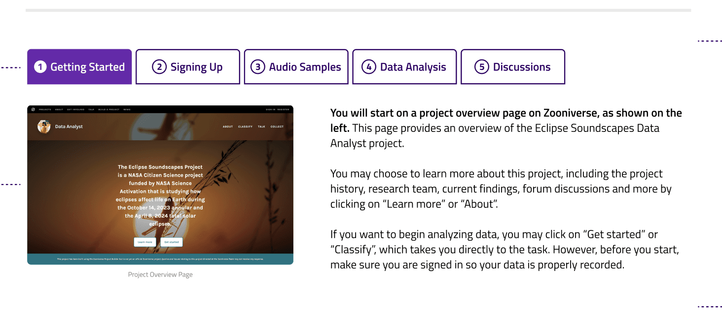
Project Overview
In this project, NASA’s Eclipse Soundscapes Project is inviting Citizen Scientists to analyze sound data during solar eclipses using Zooniverse, a third-party data analysis platform. Since this is a NASA initiative, accessibility and usability were top priorities.
As a UX Designer & Accessibility Analyst, I focused on:
Conducting an Accessibility Audit: Evaluating Zooniverse project page
Researching Alternative Tools: Exploring competitor platforms
Designing a Seamless Transition: Ensuring a smooth user experience between the project’s main website and Zooniverse.
Accessibility Audit
The project team built a test page on Zooniverse, and we were tasked with conducting an accessibility audit to ensure the site meets WCAG 2.2 standards and is intuitive to all. To achieve this, my teammates and I conduct both automated and manual audits, using tools such as WAVE, AxeDev, VoiceOver, and manual testing techniques. I was specifically responsible for testing with AxeDev and VoiceOver.
Together, we produced a 15-page accessibility report outlining key areas for improvement, their impact on usability, and actionable solutions. While Zooniverse is generally accessible, we identified several critical issues:
Low Text/Background Contrast
Missing Certain Alt-Text & Button Labels
Skipped Heading Levels
Hidden Project Descriptions for Screen readers
Unintuitive UI in Tutorials Section
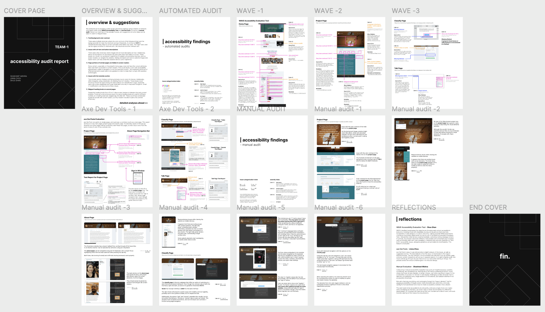
Audit Report Preview
Since the project team cannot modify Zooniverse’s backend, our ability to directly resolve accessibility issues was limited. However, we found that color contrast issues and missing button labels did not interfere with the core task of submitting sound data analysis. Similarly, skipped heading levels and hidden project descriptions only posed accessibility concerns on accessing background information.
To address these issues, we recommended enhancing Zooniverse onboarding, project descriptions, and tutorials on the project’s own website so users may go to Zooniverse and confidently perform their tasks. We also evaluated alternatives like SciStarter, but found that they presented more significant accessibility barriers that directly affected usability. Given these findings, we determined that Zooniverse remains the best option with supplemental improvements on the project’s own website.

Competitor Analysis
Wireframe Solution
Since the project team explicitly stated that they had no control over Zooniverse’s backend, our focus was on optimizing the content and flow on the home website to prepare users for the transition effectively. I analyzed existing role pages to understand how information was structured and presented and opportunities for improvement on our role page. The established structure provided a foundation, we then refined the content strategy to better guide users through project description, Zooniverse onboarding, and Zooniverse tutorial.
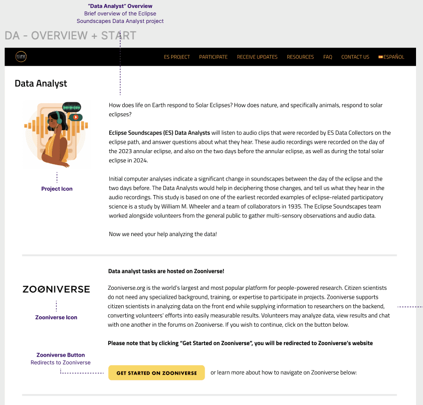
Role Overview and Zooniverse Introduction
Following the structure of other role pages, we divided key information into three sections—introducing the data analyst role, providing an overview of Zooniverse and Zooniverse tutorial. Our priority was to ensure users understood their role and were prepared for the transition to a third-party platform. To avoid confusion, we placed a prominent call-to-action button under the Zooniverse introduction.
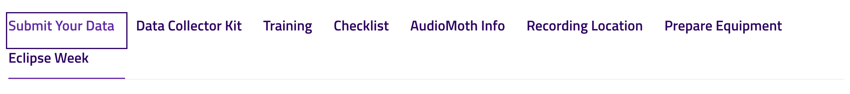
Original Tutorial Bar
Tutorial
We referred to other role pages that included a tutorial but noticed that the original step bar lacked clear structure. To improve clarity while maintaining consistency, we redesigned the step bar with a sequential order and consolidated information under fewer tabs. This ensured a more intuitive flow, reducing cognitive load and making it easier for users to follow the onboarding process.
Under each tab, we introduced:
Project Page - Provided clear breakdown of the content, as much of it was hidden from screen reader users
Sign up - Highlighted the requirement to sign up before contributing data, addressing a common point of confusion for participants
Audio Samples - Clarified how to navigate Zooniverse’s tutorial, which consisted of a series of audio samples but had unlabeled frames
Data Analysis - Introduced participants main task flow, ensuring they understood their role and the steps involved.
Discussion - Organized optional activities for post-task engagement, surfacing important links that were previously difficult to find due to low color contrast on Zooniverse.

Improvements
We tested the design with seven users and made further improvements based on their feedback, including simplifying tutorial navigation, adding clearer highlights on tutorial images, and improving textual comprehension. Five out of seven users found the page provided sufficient onboarding information and was clear and easy to follow.
Alternative Solution
While the project team was satisfied with our findings and wireframe solution, I questioned “is there really nothing we can do on Zooniverse? Any quick, non-technical hacks?”
I investigated what could be modified through Zooniverse project builder and found that while some accessibility issues such as missing labels, confusing tutorial UI and text color issues could not be fixed within Zooniverse, I discovered that swapping background images could improve some contrast issues, and adjusting heading levels could make hidden content accessible to screen readers. These were simple fixes that could be implemented in under 10 minutes.
Takeaways
Inclusive Design Under Technical Constraints
In cases where technical limitations prevent inclusive designs, there are ways to work around constraints. For example:
Content strategy as a tool: In our case, while not a substitute for true accessibility fixes, content strategy can be an accessibility tool. We “relocated” inaccessible content to the project’s main page through an onboarding process.
Small non-technical solutions can make great impact: Large portions of the Zooniverse page were hidden from screen readers, but was easily fixable but adding proper heading levels in the Project Builder.
Onboarding Isn’t Just Instructions
Users can be confused at surprising elements. Onboarding isn’t just about providing instructions. It’s about finding those elements through user testing and preparing users for them with clear expectations.
Be Proactive
Exploring Zooniverse’s Project Builder wasn’t expected or required, but it became the most direct way to improve usability. It all started when I questioned “is there really nothing we can do on Zooniverse itself?” and took action.